Calendar Design
Inspired by the work of German designer and typographer Erik Spiekermann.
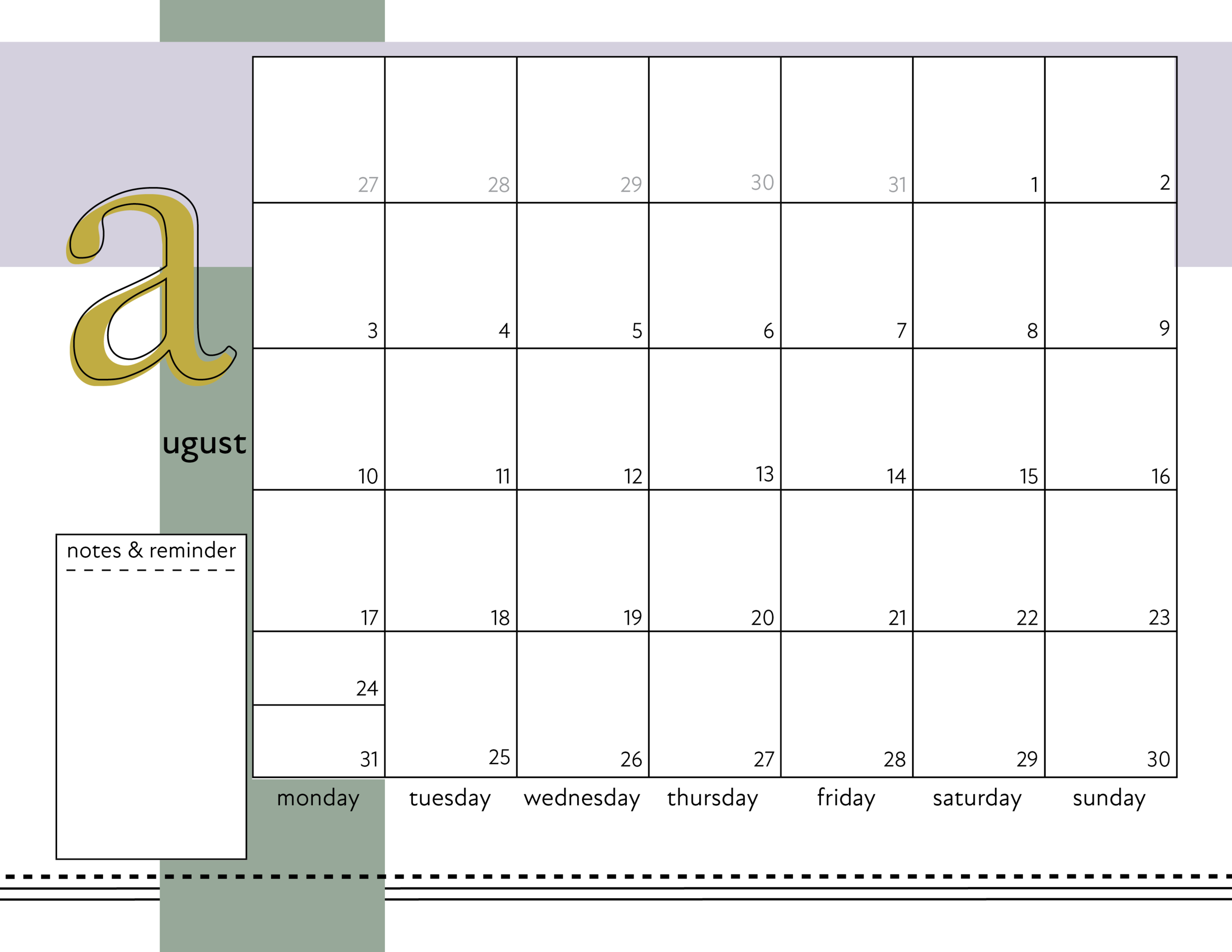
For this design I chose to look at German designer and typographer Erik Spiekermann. What I love and appreciate most about his work is that he truly designs through typography. Or in other words, the work explores what typography can do and pushes the standard limits, and his designs are formed with typography as the center. With that in mind, I approached my calendar with the plan to move away from the standard calendar layout with the month and days up top and the grid below. I moved the grid to the side covering most of the page, placed the days at the bottom and then the month to the side.
The line of dashes also is a nod to my obsession of black and white stripes, being that this is a calendar for me. Finding fonts that I felt paid tribute to Spiekermann’s designs was the hardest part.


